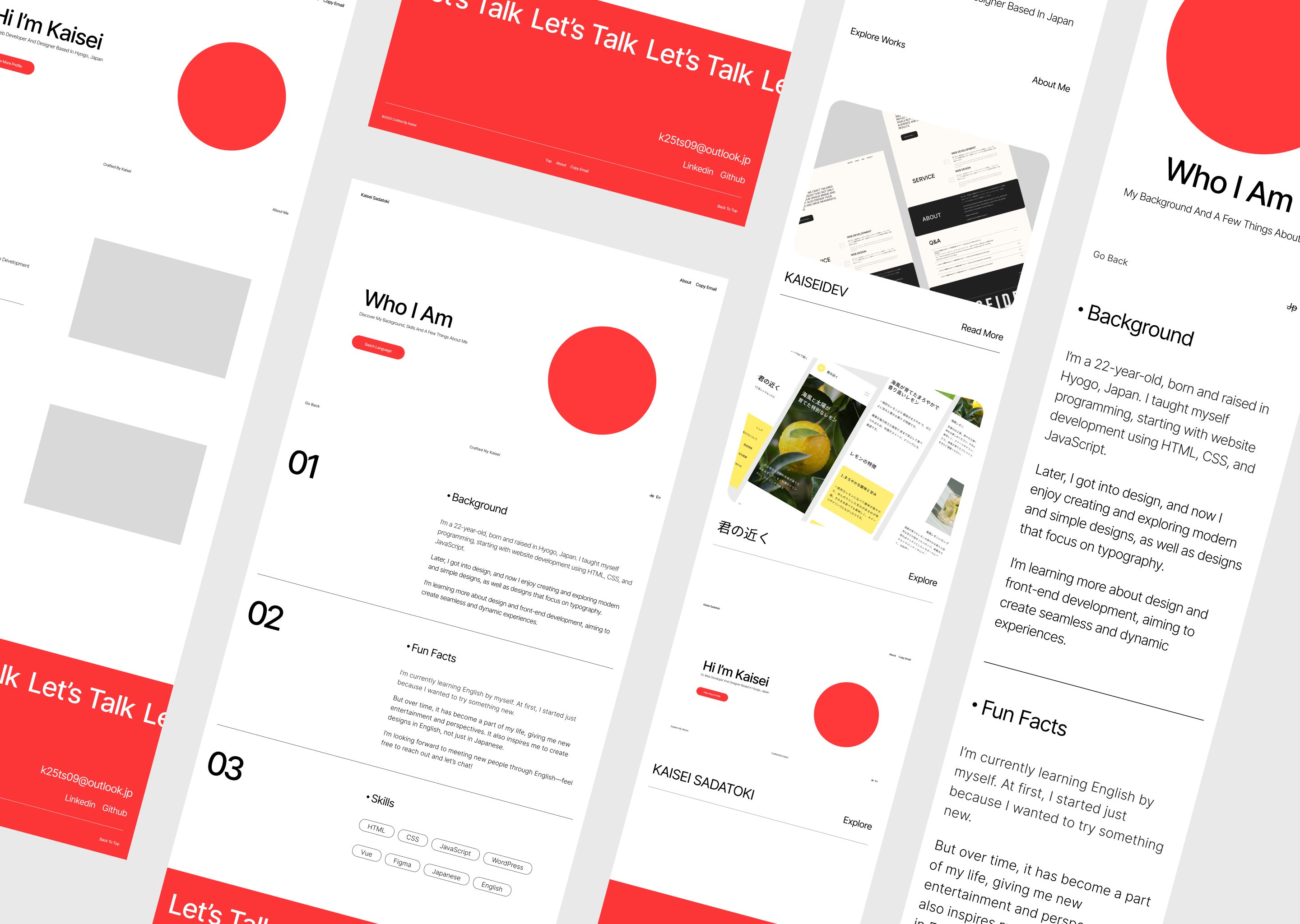
After spending some time learning design, I decided to rebuild my portfolio site to better reflect the skills I’ve developed and express the kind of design I truly want to create.
This time, I focused especially on “visual contrast” and “typography.” Rather than relying on beautiful images or complex animations, I aimed to make the design stand out by applying fundamental design principles, using text and layout to create emphasis. I also tried to reflect my personal design preferences and the overall atmosphere I enjoy.
While my previous site was mainly monochrome, I’ve now introduced an accent color—#fc3636—to create a more modern and minimal impression.
Initially, I planned to create the site entirely in Roman characters, but I realized that including Japanese where necessary added clarity and character. So, I implemented a language toggle feature. In some parts, the translations from English to Japanese are intentionally quirky, adding a playful touch to the design.